The significance of visual appeal cannot be overstated in the property market. Veteran realtors invest countless hours in home staging or suggest quick makeovers to sellers. However, when it comes to the digital space, the design of many real estate websites tends to leave users underwhelmed.
Puzzled about enhancing user experience (UX) and driving more online leads? This guide offers key insights into the best practices for designing real estate websites, complemented with industry examples.
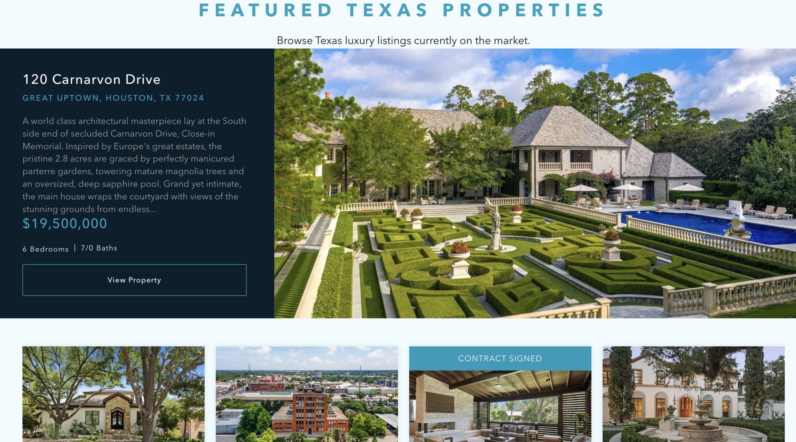
1. Implement a “Split View” Layout for Property Search Pages
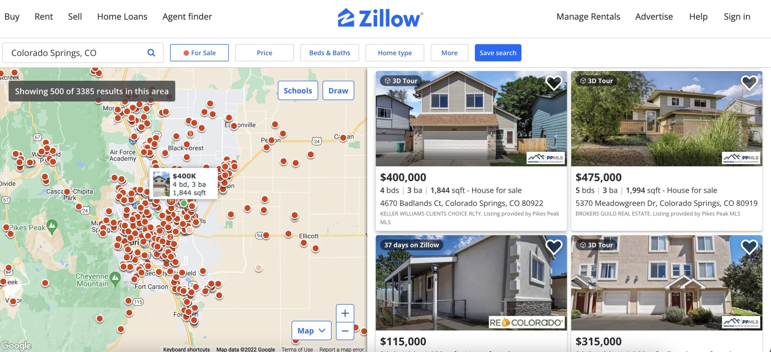
The search function is a crucial element for larger real estate platforms. More than 40% of potential buyers commence their property hunt online.
To efficiently present your full property catalogue, think about employing a split-view layout. You can showcase consolidated property listings on the right and provide a map view on the left, similar to Zillow’s approach, or use the left section for a close-up display of the chosen property.
However, keep in mind that the split-view page layout can appear messy on mobile devices. Hence, it might be wise to omit this feature in your mobile website version. Alternatively, you can integrate a map-based property view for each listing.
2. Clearly Highlight Property Locations
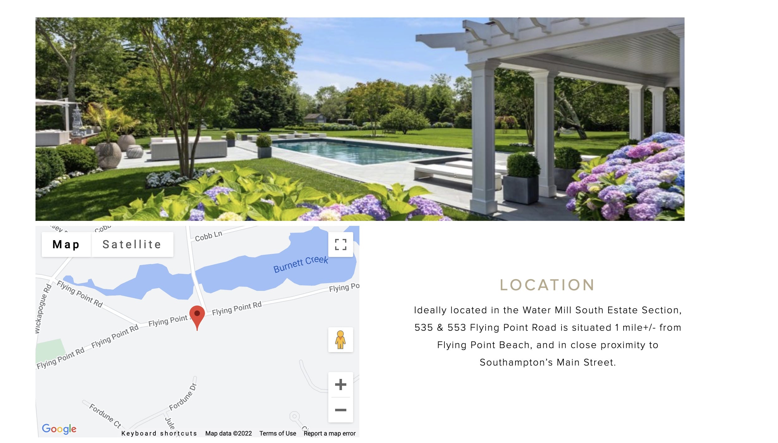
The location of a property is a crucial determinant of its relevance to a listing. Most buyers and renters rank neighborhoods according to their personal preferences, such as convenient commuting times or budget restrictions, or based on prior suggestions from friends, family, or real estate agents.
By incorporating a map view that specifies an exact or approximate location of a property, you prevent users from having to open another tab to investigate the area. This straightforward approach helps reduce the bounce rate and increase time-on-page—two significant metrics for search engine optimization (SEO) and conversion rate optimization (CRO).
3.Establish Informative Page Categories
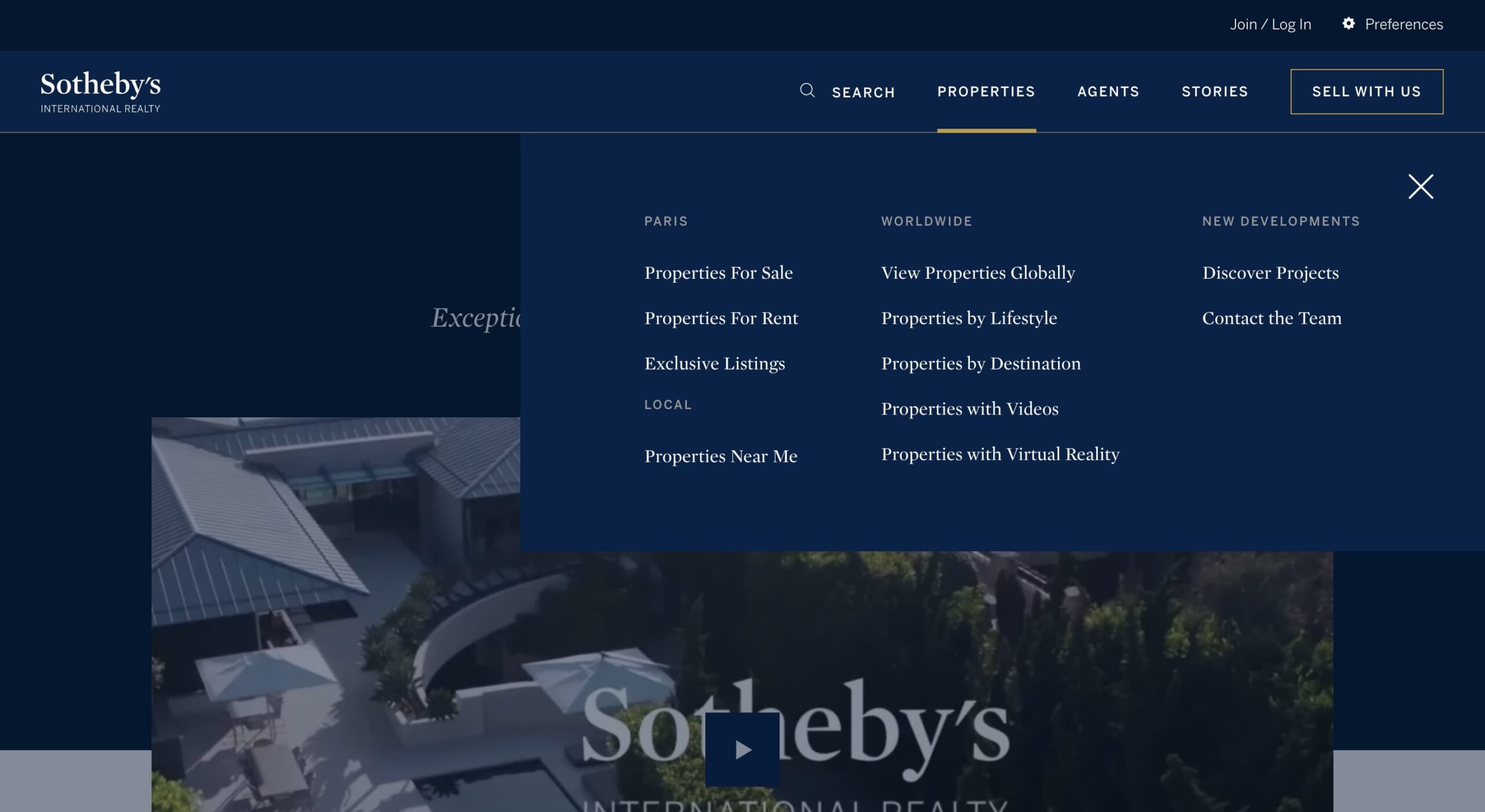
Facilitate users in locating the content they need through concise microcopy and easily navigable links. Larger real estate websites could include a drop-down menu in the header navigation bar to offer customers a wide range of choices.
For instance, Sotheby’s helpfully sorts various properties by location, lifestyle preferences, or video/VR touring options. Users can then further refine their search results by picking subcategories that pique their interest (for example, rural homes in Northern England).
While working on your real estate website design, ensure your information architecture—the framework for presenting data on the site—mirrors your customers’ research process and encourages effortless navigation across different sub-pages.
4.Construct Unambiguous Clickable Areas
Every visual component on a website can have one or several clickable areas that lead to a single (for example, listing page) or multiple destinations (like the listing page or a virtual tour page). When text and graphics merge into a single design element like a banner image, users might be unsure about where to click to reach their intended destination.
The real estate website of Forge Partners addresses this issue by visualizing the user’s cursor movements as a graphic element (an arrow transforming into a dot) and spotlighting clickable website sections with color overlays. This approach gives users an unforgettable, vibrant browsing experience and ensures they fully understand how the website will react to their interactions.
Think about adding extra guidance if your target audience includes older demographics (such as Baby Boomers, Gen X) who may not feel as comfortable browsing online.
5.Opt for Succinct Website Copy

Given that most real estate websites need to accommodate a wealth of information, it’s advisable to favor concise marketing copy. Ensure your calls to action (CTAs), such as page headings, subheadings, and button texts, are brief and catchy. Allocate ample “breathing space” between various text components to guide viewers’ focus towards your taglines.
6.Try Out Horizontal Scrolling
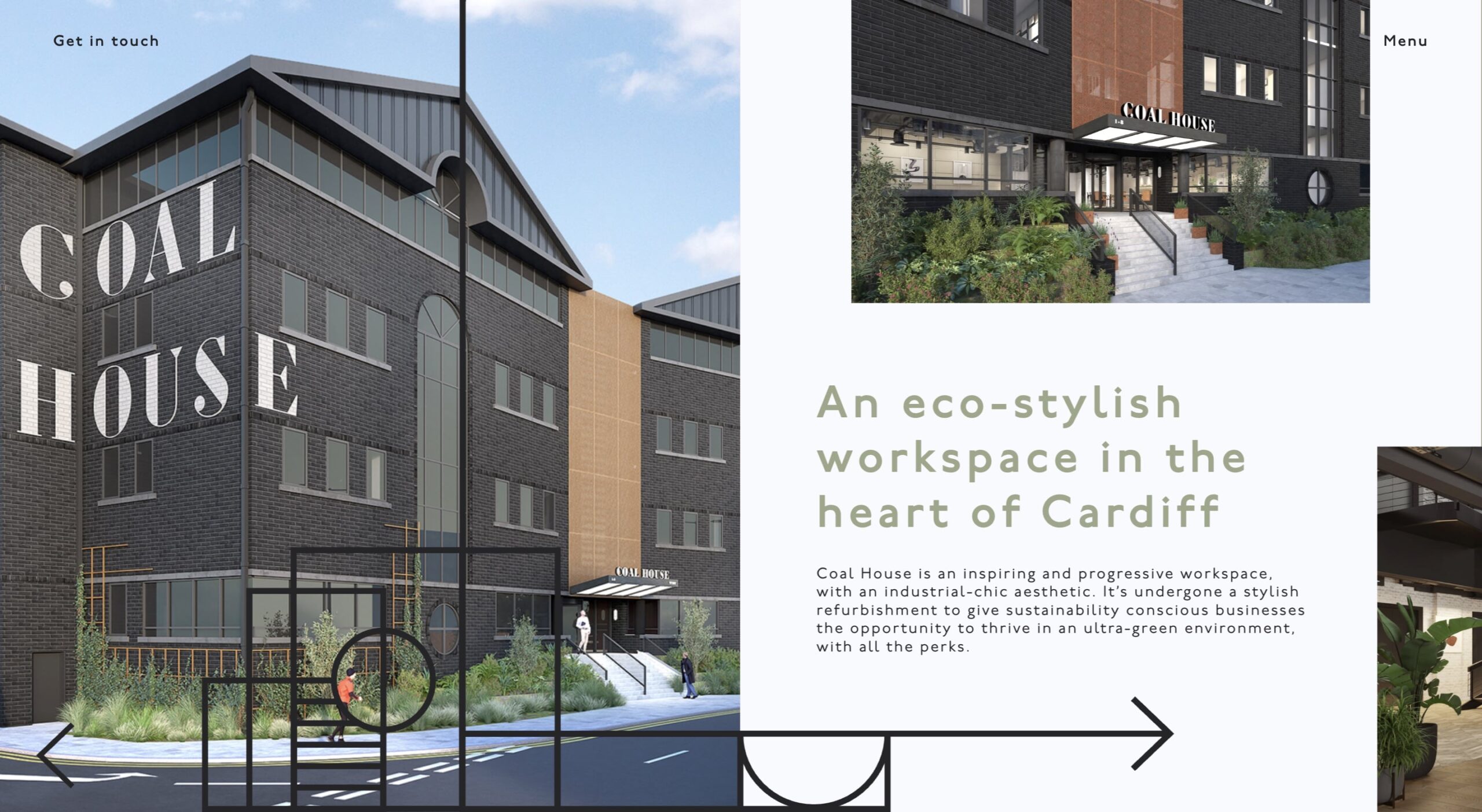
The typical website presents a vertical, top-to-bottom scrolling experience, which is a familiar pattern for users. Nonetheless, horizontal scrolling (left-to-right) could offer a more interactive and memorable browsing experience. This method encourages readers to concentrate on the content instead of mindlessly scrolling down a website.
This layout is most suitable for real estate websites showcasing a single development project or property. Dedicate each screen to a central message—a comprehensive project overview, unique selling propositions, additional benefits and amenities, and the final call to action (CTA).
7.Implement Progressive Disclosure
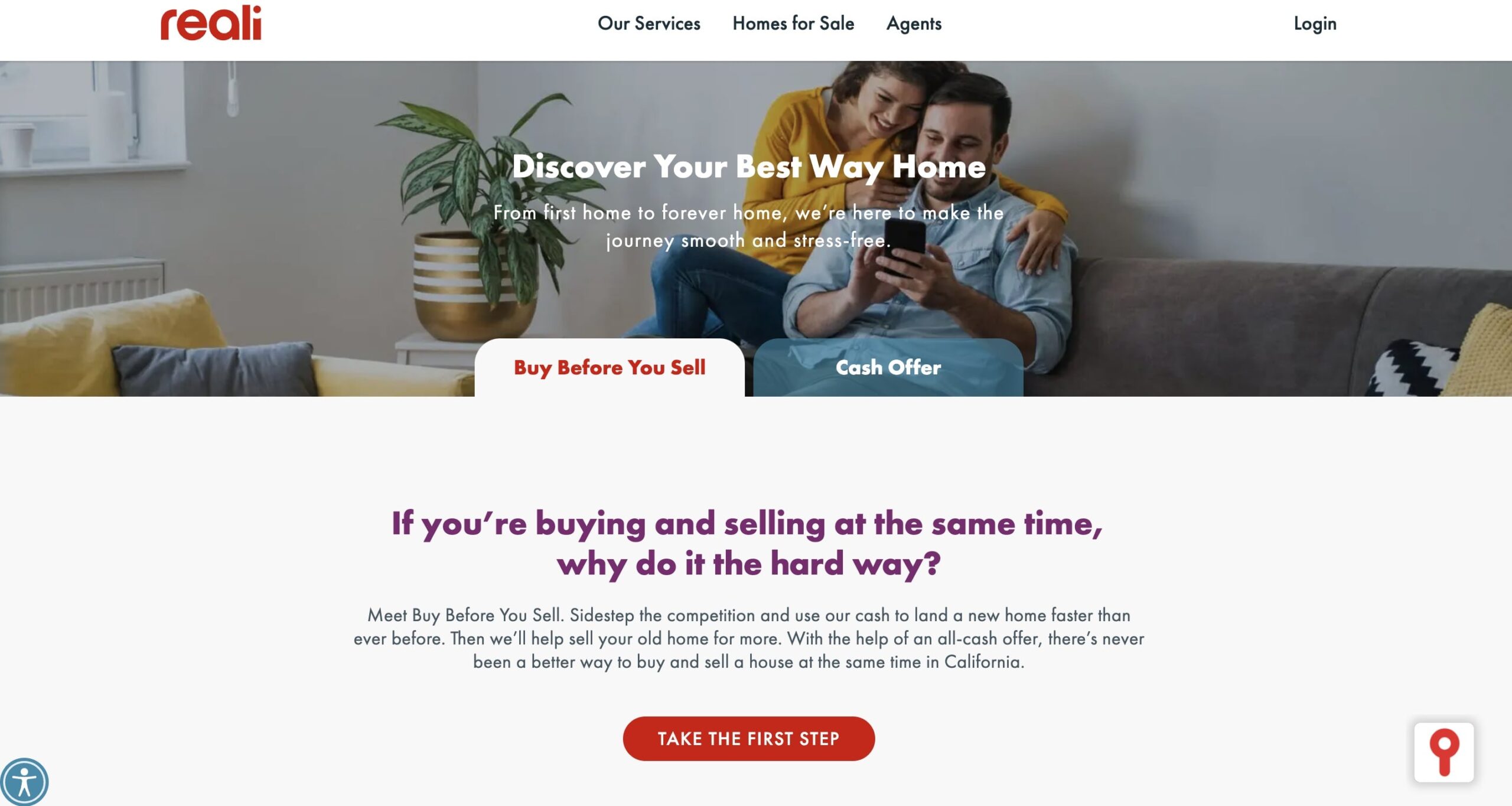
The concept of progressive disclosure involves postponing secondary information and user steps to a subsequent screen. Rather than overwhelming users with a lengthy block of text, initially present only the most crucial options. Then, arrange navigation paths to explore secondary options.
Reali exemplifies this by partitioning main purchase options into distinct screens and deferring form submission to another screen. With more specialized options accessible upon request, users don’t have to concern themselves with the extra complexity of completing a task straight away. Instead, they can reflect on the information provided to mentally gear up for the next step.
8. Provide a 3D Property Tour
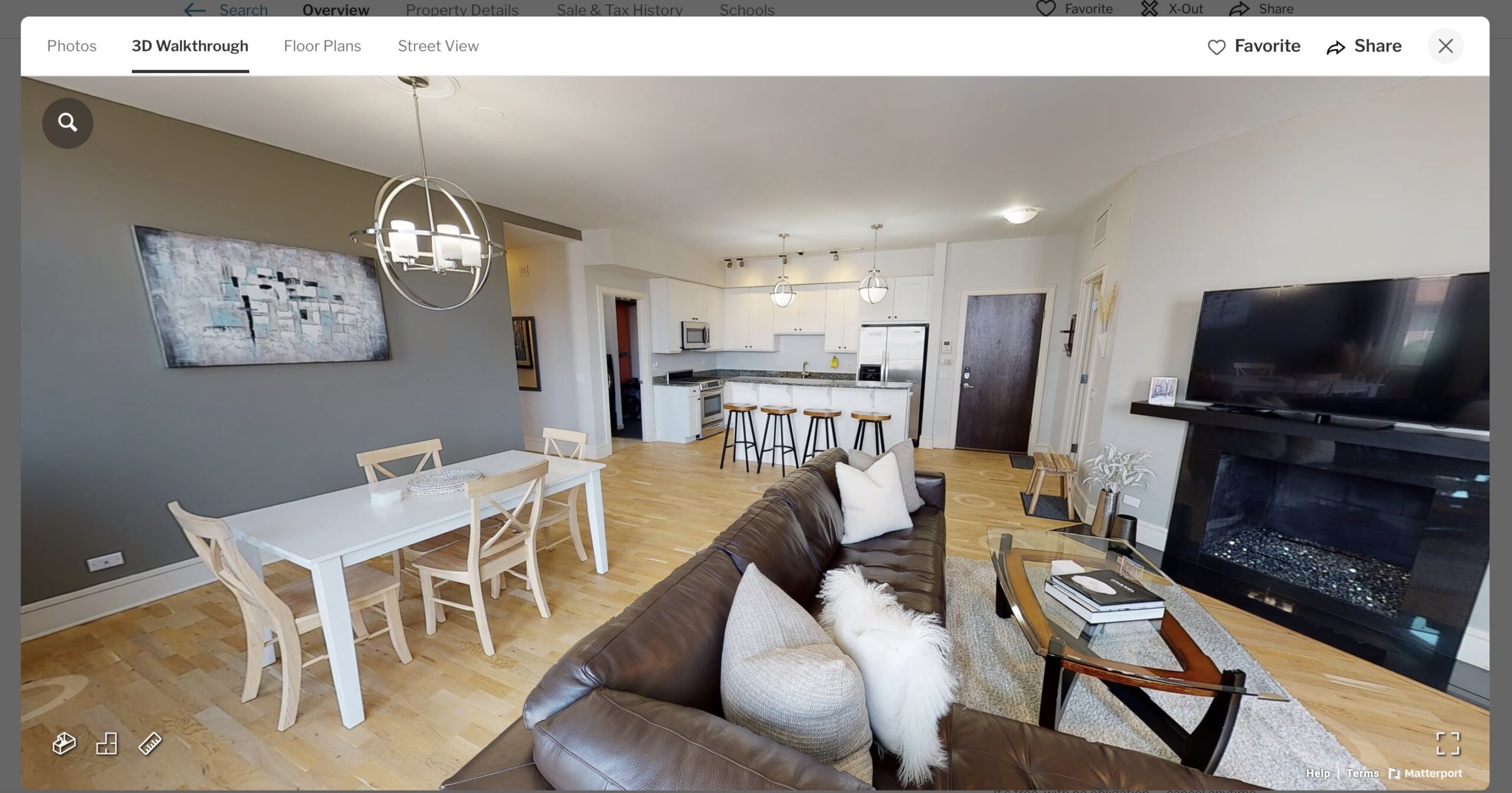
The National Association of Realtors reports that since the start of the pandemic, 73% of buyers’ agents consider virtual tours, and 74% deem videos, more important for their listings.
Virtual tours enable your clients to gain a comprehensive understanding of the floor plans, atmosphere, and amenities offered, all from their homes’ comfort. They can then organize visits to their top picks.
3D property tours also save your agents’ time, allowing them to concentrate more on “warm” leads rather than those still in the early stages of their research process.
This approach enables you to concentrate on sealing more deals and adding more leads to your pipeline more efficiently.
9. Avoid Video Auto-Play
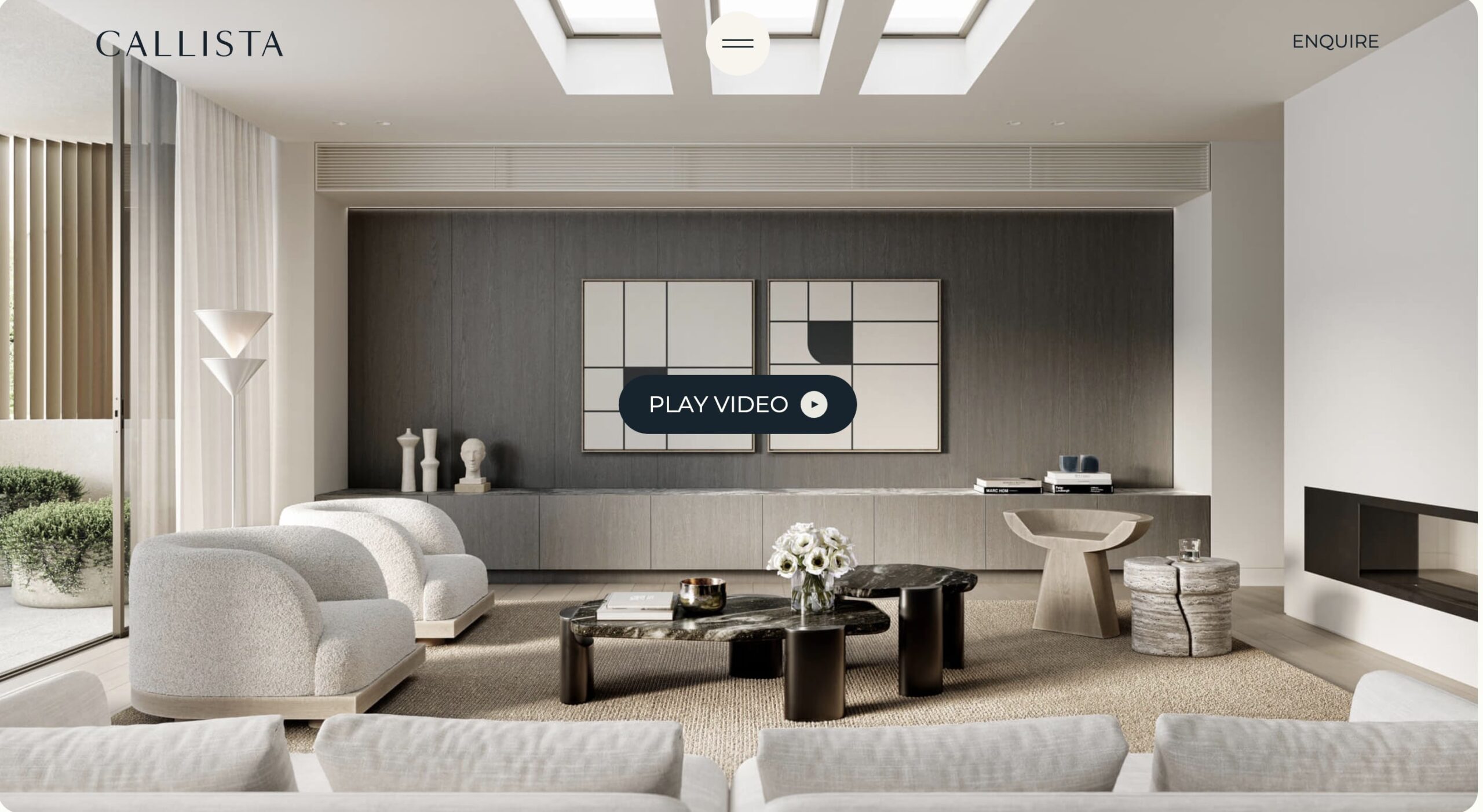
Videos bring additional interactivity to real estate website designs. However, auto-playing a video as soon as a visitor arrives on the page can provoke a negative response, especially on mobile. Give users the control to decide when they want to watch a property video.
Callista captures the viewer’s attention on the video with an animated zoom-in. When the video fills the viewer’s entire screen, the “Play” button appears. This method gently encourages the visitor to pause and watch the video instead of forcing the viewing experience on them.
10. Experiment with Hierarchical Grids for Property Listing Pages
In web design, a grid is a system for organizing content on the page. The most important page elements in a hierarchical grid are emphasized using rows, modules, or columns.
The most critical information occupies the most space on the website. Hierarchical grids help direct visitors’ attention to your most significant offerings—your “crown jewel” property, current promotional offer, or an on-site contact form.
11. Showcase Your Team

The About page is the second most frequented page on real estate websites. Its primary objective: to build confidence and foster trust with potential clients.
When accessing an About page, most homebuyers want to see the real people behind your agency, not read an ambiguous corporate company description.
To make your About page more engaging, include photos of your key staff along with brief professional bios.
Don’t hesitate to show some personality, as demonstrated by Hayden Outdoors. Rather than sharing standard corporate photos, the agency presents its team as relatable individuals who share their target audience’s passion for outdoor living.
12. Incorporate Customer Self-Service Tools
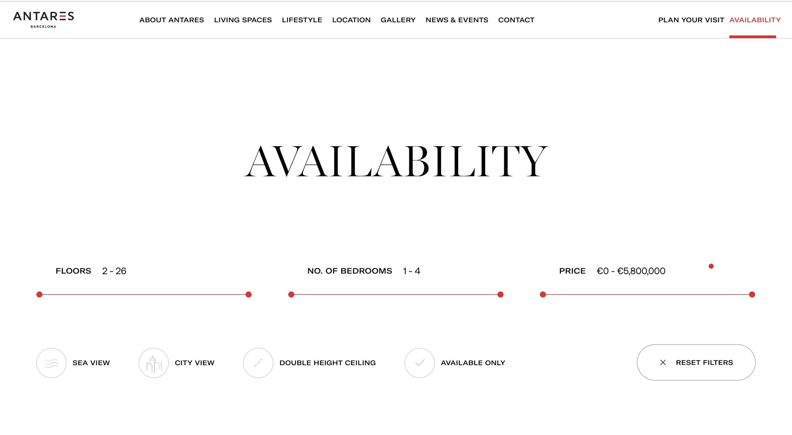
Digital-only retail platforms like Zillow, Houzz, and Redfin have won over customers with a streamlined self-service experience. Today, most customers expect regional players to match this and offer a similar multichannel experience. Don’t restrict a client’s contact options to phone or email. Almost 40% of millennial homebuyers are comfortable making an offer after only an online visit.
Incorporating on-site self-service tools such as scheduling in-person or virtual visits, calculating selling prices, or checking rental property availability can significantly expedite the conversion process. Antares Barcelona provides visitors with a handy search bar for verifying property availability, requesting floor plans, and arranging a virtual or in-person tour. This set of tools helps transition prospects from the evaluation to engagement stages without involving their agents.
Final Thoughts
When designing a real estate website, adopt a user-focused strategy. Contemplate the users’ objectives, tasks, and probable on-site behaviors. Then, transform them into a user journey map. Organize your website information architecture, navigation paths, and page layout around the expected user actions.
Adjust and refine the finer details over time and introduce more self-service features to appeal to younger buyers.